In this series, as I “get to know” some technology, I collect and share resources that I find helpful, as well as any tips, tricks and notes that I collected along the way.
My goal here is not to teach every little thing there is to learn, but to share useful stuff that I come across and hopefully offer some insight to anyone that is getting ready to do what I just finished doing.
As always, I welcome any thoughts, notes, pointers, tips, tricks, suggestions, corrections and overall vibes in the Comments section below…
TOC
- What is Web Performance Optimization?
- Why do I need to optimize my website?
- How do I get started?
- BLUF
- Glossary
- Notes
- Tips
- Tricks
- Summary
- Resources
What is Web Performance Optimization?
So, WPO is just a massive beast. There are so many parts, strewn across so many branches of tech and divisions and teams, that each “part” really deserves its own “Getting to Know” series. Maybe some day.
But for now, I am going to cover what I consider to be the most important high-level topics, drilling down into each topic a little bit, offering best practices, suggestions, options, tips and tricks that I have collected from around the Interwebs!
So, let’s get to know… WPO!
Why do I need to optimize my website?
The first couple things to understand is that a) “web performance” is not just about making a page load faster so someone can get to your shopping cart faster, and b) not everyone has blazing fast Internet and high-powered devices.
The web is more than just looking at cat pics, sharing recent culinary conquests or booking upcoming vacations. People also use the web for serious life issues, like applying for public assistance, shopping for groceries, dealing with healthcare, education and much more.
And for the 2021 calendar year, GlobalStats puts Internet users at 54.86% Mobile, 42.65% Desktop and 2.49% Tablet, and of those mobile users, 29.24% are Apple and 26.93% are Samsung, with average worldwide network speeds in November 2021 of 29.06 Mbps Download and 8.53 Mbps Upload.
And remember, those are averages, skewed heavily by the highly-populated regions of the industrialized world. Rural areas and developing countries are lucky to get connections at all.
So for people that really depend on the Internet, and may not have the greatest connection, nor the most powerful device, let’s see what we can do about getting them the content they want/need, as fast and reliably as possible.
How do I get started?
This was a tough one to get started on, and certainly to collect notes for, because, as I mentioned above, the topics are so wide, that it took a lot to try to pull them all together…
WPO touches on server settings, CDNs, cache control, build tools, HTML, CSS, JS, file optimizations, Service Workers and more.
In most organizations, this means pulling together several teams, and that means getting someone “up the ladder” to buy into all of this to help convince department heads to allocate resources (read: people, so read: money)…
Luckily, there have been a LOT of success stories, and they tend to want to brag (rightfully so!), so it has actually never been easier to convince bosses to at least take a look at WPO as a philosophy!
BLUF
You’ll find details for all of these below, but here are the bullets, more-or-less in order…
- HTTP3 before HTTP2, HTTP2 before HTTP1.1
- Cache-Control header, not Expire
- CDN
preconnectto third-party domains and sub-domainspreloadimportant files coming up later in pageprefetchresources for next pageprerenderpages likely to navigate to next
Speculation Rules for pages likely to navigate to nextfetchpriorityto suggest asset importance- Split CSS into components/
@mediasizes, load conditionally - Inline critical CSS, load full CSS after
- Replace JS libraries with native HTML, CSS and JS, when possible
- Replace JS functionality with native HTML and CSS, when possible
async/deferJS, especially 3rd party- Split JS into components, load conditionally / if needed
- Avoid Data-URIs unless very small code
- Embedded SVG before icon fonts, icon fonts before image sprites, image sprites before numerous icon files
- WOFF2 before WOFF
font-display: swap- AVIF before WEBP, WEBP before JPG/PNG
- Multiple crops for various screen sizes / connection speeds
srcset/sizesattributes for automated size swapmediaattribute for manual size swaploading="lazy"for initially-offscreen images- WEBM before MP4, MP4 before GIF
preload="none"for initially-offscreen videoswidth/heightattributes on media and embeds, use CSS to make responsive- Optimize all media assets
- Lazy-load below the fold content
- Reserve space for delayed-loading content, like ads and 3rd-party widgets
- Create flat/static versions of dynamic content
- Minify / compress text-based files (HTML, CSS, JS, etc.)
requestIdleCallback/requestAnimationFrame/scheduler.yieldto pause CPU load / find better time to run tasks- Service Worker to cache / reduce requests, swap content before requesting
Note that the above are all options, but might not all work / be possible everywhere. And each should be tested to see if it helps in your situation.
Glossary
We need to define some acronyms and terms to ensure we’re all speaking the same language… In alpha-order…
- CLS (Cumulative Layout Shift)
- Visible layout shift as a page loads and renders
- Core Web Vitals
-
Three metrics that score a page load:
- LCP: ideally <= 2.5s
- INP: ideally <= 200ms
- CLS: ideally <= 0.10
- Critical Resource
- Any resource that blocks the critical rendering path
- CRP (Critical Rendering Path)
- Steps a browser must complete to render page
- CrUX (Chrome User Experience)
- Perf data gathered from RUM within Chrome
- DSA (Dynamic Site Acceleration)
- Store dynamic content on CDN or edge server
- FCP (First Contentful Paint)
- First DOM content paint is complete
- FMP (First Meaningful Paint)
- Primary content paint is complete; deprecated in favor of LCP
- FID (First Input Delay)
- Time a user must wait before they can interact with the page (still a valid KPI, but use INP instead)
- FP (First Paint)
- First pixel painted (not really used anymore, use LCP instead)
- INP (Interaction to Next Paint)
- Longest time for user interaction to complete
- LCP (Largest Contentful Paint)
- Time for largest page element to render
- Lighthouse
- Google lab testing software. Analyzes and evaluates site, returns score and possible improvements
- LoAF (Long Animation Frames)
- Slow animation frames which might affect INP
- PoP (Points of Presence)
- CDN data centers
- Rel mCvR (Relative Mobile Conversion Rate)
- Desktop Conversion Rate / Mobile Conversion Rate
- RUM (Real User Monitoring)
- Data collected from real user experiences, not simulated
- SI (Speed Index)
- Calculation for how quickly page content is visible
- SPOF (Single Point of Failure)
- Critical component that can break everything if it fails or is missing
- Synthetic Monitoring
- Data collected from similuated lab tests, not real user experiences
- TBT (Total Blocking Time)
- Time between FCP and TTI
- TTFB (Time to First Byte)
- Time until first byte is received by browser
- TTI (Time to Interactive)
- Time until entire page is interactive
- Tree Shaking
- Removing dead code from code base
- WebpageTest
- Synthetic monitoring tool, offers free and paid versions
Notes
-
CRP (Critical Rendering Path)
- To start to understand web performance, you must first understand CRP.
- The CRP is the steps a browser must go through before before it can render (display) anything on the screen.
-
This includes downloading the HTML document and parsing it, as well as finding, downloading and parsing any CSS or JS files (that are not
asyncordefer). - All of the above document types are considered render-blocking assets, as the browser cannot render anything to the screen until they are all downloaded and parsed.
- These actions allow the browser to create the DOM (the structure of the page) and the CSSOM (the layout and look of the page).
-
Any JS files that are not
asyncordeferare render-blocking because their contents could affect the DOM and/or CSSOM. - Naturally downloading less is always better: less to download, less to parse, less to construct, less to render, less to maintain in memory.
-
Three levels of UX
As the above process is happening, the user experiences three main concerns:
-
Is anything happening?
Once a user clicks something, if there is no visual indicator that something is happening, they wonder if something broke, and so the experience suffers.
-
Is it useful?
Once stuff does start to appear, if all they see is placeholders, or partial content, it is not useful yet, so the experience suffers.
-
Is it usable?
Finally, once everything looks ready, is it? Can they read anything, or interact yet? If not, the experience suffers.
-
-
Three Core Web Vitals
The three questions above drive Google’s Core Web Vitals: they are an attempt to quantify the user experience.
-
“Is anything happening?” becomes LCP (Largest Contentful Paint)
When the primary content section becomes visible to the user.
Considerations:- TTFB is included in LCP (see below).
- CSS, JS, custom fonts, images, can all delay LCP.
- Not just download time, but also processing time: DOM has to be rendered, CSS & possibly JS processed, etc.
- Remember, each asset can request additional assets, creating a snowball effect.
-
“Is it useful?” becomes INP (Interaction to Next Paint)
Time for the page to complete a user’s interaction.
Considerations:- How busy the browser already is when the user interacts.
- How resource-intensive the interaction is.
- Whether the interaction requires a fetch before it can respond.
-
“Is it usable?” becomes CLS (Cumulative Layout Shift)
Layout shifts as a page loads and renders.
Considerations:- Delay in loading critical CSS and/or font files.
- JS updates to the page after the initial render.
- Dynamic or delayed content loading into the page.
And because TTFB is included in LCP, and might indicate issues related to INP, I consider it to be the D’Artagnon of the three Core Web Vitals (sort of their fourth Musketeer)… ;-)
-
TTFB (Time to First Byte)
Time between the browser requesting, and receiving, the asset’s first byte.
(Usually discussed related to the page/document, but also part of every asset request, including CSS, JS, images, videos, etc., even from a 3rd party.)
Considerations:- Connection speed, network latency, server speed, database speed, etc.
- Distance between user and server (even at near light speed, it still takes time to travel around the world).
- Static assets are always faster than dynamic ones.
-
</li>
<li>
<h3>Analysis Prep</h3>
The first step to testing is analysis.
<ol>
<li>
<h4>Find out who your audience is</h4>
<ul>
<li>
Where they are geographically, what type of network connection they typically have, what devices they use.
</li>
<li>
Ideally this comes from RUM data, reflecting your real-life users, ideally via analytics.
</li>
</ul>
</li>
<li>
<h4>Look for key indicators</h4>
<ul>
<li>
Any problems/complaints your project currently experiences, to be used to determine goals.
</li>
<li>
Perhaps your site has a TTFB of 3.5 seconds, and a LCP of 4.5 seconds, and a CLS of 0.34.
</li>
<li>
All of these should be able to be improved, so they are great candidates for goals.
</li>
</ul>
</li>
</ol>
</li>
<li>
<h3>Goals and Budgets</h3>
A goal is a target that you set and work toward, such as "TTFB should be under 300ms" or "LCP should be under 2s".
A budget is a limit you set and try to stay under, such as "no more than 100kb of JS per page" or "hero image must be under 200kb".
<ul>
<li>
<h4>How to choose goals?</h4>
<ul>
<li>
Maybe compare your site against your competition's.
</li>
<li>
Google's Core Web Vitals could be another consideration.
</li>
<li>
Goals have to be achievable: If your current KPIs are too far from your long-term goals, consider creating less-aggressive short-term goals; you can always re-evaluate periodically.
</li>
</ul>
</li>
<li>
<h4>How to create budgets?</h4>
<ul>
<li>
Similar to goals, compare against competition, research current stats, or look for problem areas and set limits to control them.
</li>
<li>
For existing projects, starting budget can be "no worse than it is right now"...
</li>
<li>
For new sites, can start with "talking points" for the team, to help set limits on a project, then refine as needed.
</li>
<li>
Budgets can change as the site changes; Reach a new goal? Adjust budget to reflect that. Adding a new section/feature? That will likely affect the budget.
</li>
</ul>
</li>
<li>
<h4>How to stick to budgets?</h4>
<ul>
<li>
<a href="https://github.com/GoogleChrome/lighthouse-ci">Lighthouse CI</a> integrates with GitHub to test changes during builds, stopping deployments.
</li>
<li>
<a href="https://www.speedcurve.com/">Speedcurve</a> dashboard sets budgets, monitors, and notifies team of failures.
</li>
<li>
<a href="https://calibreapp.com/">Calibre</a> estimates how 3rd party add-ons will affect site, or how ad-blockers will affect page loads.
</li>
</ul>
</li>
<li>
<h4>What if a change breaks the budgets?</h4>
<ul>
<li>
Optimize feature to get back under budget.
</li>
<li>
Remove some other feature to make room for the new one.
</li>
<li>
Don't add the new feature.
</li>
</ul>
</li>
</ul>
These are tough decisions and require buy-in from all parties involved. the goal is to improve your site, not create civil wars. Both goals and budgets need to be realistic, or no one is going to be able to meet them, and then they just become a source of friction, and will soon just be ignored.
</li>
<li>
<h3>Analysis process</h3>
<ul>
<li>
<h4>Synthetic testing</h4>
With your goals set, design and test improvements to see if they get closer to goals. This is "lab data": testing, trying, evaluating, repeating, until you think you have a solution.
</li>
<li>
<h4>Evaluate</h4>
Each test should try <strong>one improvement</strong>, to be sure your results are the direct effect of your improvement. This tells you if that improvement is worth keeping, needs polishing, or is ready to ship.
</li>
<li>
<h4>RUM testing</h4>
Finally test "in the wild", make sure you are seeing the same results there as in the lab. If not, try to determine why.
</li>
</ul>
But remember, Synthetic and RUM will <strong>never</strong> be identical; the lab has constraints that the real world doesn't, and the real world has variables that the lab doesn't.
These are two different testing environments, each with its pros and cons, intended for two very different purposes.
I always say "Synthetic is what <em>should</em> be, and RUM is what <em>is</em>"; we can only control so much in the real world, that's why we try to polish everything as much as possible, hoping that when real world variables happen, our site is stable enough that they won't affect things too badly.
</li>
<li>
<h3>Analysis tools</h3>
Some tools allow you to test in live browsers, on a variety of devices, alter connection speeds, run multiple tests, and receive reports of request, delivery, and processing times for all of it.
Other tools allow you to run your site against a defined set of benchmarks, receiving estimations of speeds and reports with improvement suggestions.
Still other tools let you work right in your browser, testing live or local sites, hunting for issues, testing quickly.
(There aare numerous RUM and Synthetic providers out there, but below I will focus on those that are, or at least offer, free levels. If you think I should add something, let me know.)
<ul>
<li>
<h4><a href="https://cruxvis.withgoogle.com/">CrUX</a></h4>
<ul>
<li>
RUM data, limited to opt-in Chrome users only, if your site gets sufficient traffic.
</li>
<li>
Shows Core Web Vitals and other KPI data, offers filters (Controls) and drill-down into each KPI.
</li>
<li>
The <em>data</em> collected by CrUX is also available via <a href="https://developer.chrome.com/docs/crux/api" target="_blank">API</a>, <a href="https://developer.chrome.com/docs/crux/bigquery" target="_blank">BigQuery</a>, and is ingested into several other tools, such as PageSpeed Insights (see below), <a href="https://www.debugbear.com/docs/crux-trends" target="_blank">DebugBear</a>, <a href="https://gtmetrix.com/blog/how-to-view-crux-data-on-gtmetrix/" target="_blank">GTMetrix</a> and more.
</li>
</ul>
</li>
<li>
<h4><a href="https://pagespeed.web.dev/">PageSpeed Insights</a></h4>
<ul>
<li>
Pure lab testing, no real devices, just assumptions based on the code.
</li>
<li>
First split for Mobile & Desktop, then nice score up front, including grades on the Core Web Vitals, followed by things that you could try to improve these scores, and finally things that went well.
</li>
<li>
This tool is powered by the same tech that powers DevTools' Lighthouse tab and Chrome extension.
</li>
</ul>
</li>
<li>
<h4><a href="https://www.webpagetest.org/">WebpageTest</a></h4>
<ul>
<li>
Actual run-tests, in real browsers on real devices, in locations around the globe.
</li>
<li>
Device and browser options vary depending on location.
</li>
<li>
Advanced Settings vary depending on device and browser.
</li>
<li>
Advanced Settings tabs allow you to Disable JS, set UA string, set custom headers, inject JS, send username/password, add Script steps to automate actions on the page, block requests that match substrings or domains, set SPOF, and more.
</li>
<li>
"Performance Runs" displays median runs, if you do multiple runs, for both first and repeat runs.
</li>
<li>Waterfall reports:
<ul>
<li>
Note color codes above report.
</li>
<li>
Start Render, First Paint, etc. draw vertical lines down the entire waterfall, so you can see what happens before & after these events, as well as which assets affect those events.
</li>
<li>
Wait, DNS, etc. show in the steps of a connection.
</li>
<li>
Light | Dark color for assets indicate Request | Download time.
</li>
<li>
Click each request for details in a scrollable overlay; also downloadable as JSON.
</li>
<li>
JS execution tells how long each file takes to process.
</li>
<li>
Bottom of waterfall, Main Thread is flame chart showing how hard the browser was working across the timeline.
</li>
<li>
To right of each waterfall is filmstrip to help view TTFB, LCP; Timeline compares filmstrip with waterfall, so you see how waterfall becomes visible, and how assets affect it.
</li>
<li>
Check all tabs across top (Performance Review, Content Breakdown, Processing Breakdown, etc.) for many more features.
</li>
</ul>
</li>
<li>
The paid version offers several beneficial features, but the free version is likely enough to at least get you started.
</li>
</ul>
</li>
<li>
<h4><a href="https://www.browserstack.com/">BrowserStack</a></h4>
<ul>
<li>
Test real browsers on remote servers.
</li>
<li>
Also offer automated testing, including pixel-perfect testing.
</li>
<li>
Free version has usage limits.
</li>
</ul>
</li>
<li>
<h4>Browser DevTools</h4>
<ul>
<li>
All modern browsers have one, and all vary slightly.
</li>
<li>
My personal opinion is that Chrome's DevTools is the standard, with it's Performance tab and Lighthouse extension.
</li>
<li>
Other browsers also have strengths that Chrome lacks, such as Firefox's great CSS grid visualizer and Safari's ability to connect directly to an iPhone and inspect what is currently loaded in the device's Safari browser.
</li>
<li>
I do not use any other browser enough to have an opinion, but would welcome any notes you care to share in <a href="#comments">the Comments section below</a>. ;-)
</li>
</ul>
</li>
</ul>
</li>
<li>
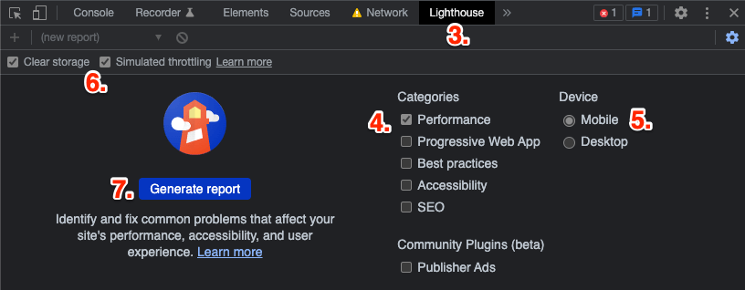
<h3>Analysis Example</h3>
For this process, I recommend Chrome, if only for the Lighthouse integration:
<ol>
<li>Open site in Incognito</li>
<li>Open DevTools</li>
<li>Go to Lighthouse tab</li>
<li>Under "Category", only check "Performance"</li>
<li>Under "Device" check "Mobile"</li>
<li>Check "Simulated throttling"<br>(click "Clear storage" to simulate a fresh cache)</li>
<li>Click "Generate Report"</li>
<li>Look for issues</li>
<li>Fix <strong>one</strong> issue</li>
<li>Re-run audit</li>
<li>Evaluate audit for that <strong>one</strong> change</li>
<li>Determine if change was improvement, decide to keep or revert</li>
<li>Repeat from step 7, until no issues or happy with results</li>
</ol>
Tips
-
Server
-
Use HTTP/3
Not widely adopted yet, but growing.Supported all across all major browsers, considered Baseline.There are numerous differences, but the key improvements are related to connection speed, stability and security:
- Uses QUIC, instead of TCP, for faster connection.
- Uses “UDP for faster transmission.
- QUIC also allows for network swaps, helping mobile users.
- Uses TLS 1.3 for improved security.
Supported by all major browsers, considered Baseline.
If a device does not support HTTP/3, it will automatically degrade to HTTP/2.
-
If you cannot use HTTP/3, use HTTP/2
Created in 2015, primarily focused on mobile and server-intensive graphics/videos, it is based on Google’s SPDY protocol, which focuses on compression, multiplexing, and prioritization.
Key differences:
- Binary, instead of textual.
- Fully multiplexed, instead of ordered and blocking.
- Can use one connection for parallelism.
- Uses header compression to reduce overhead.
allows servers to “push” responses proactively into client caches
This was removed from the spec.
Supported by all major browsers; IE11 works on Win10 only; IE<11 not supported at all.
If a device does not support HTTP/2, it will automatically degrade to HTTP/1.x.
-
TLS
Upgrade to 1.3 to benefit from reduced handshakes for renewed sessions, but be sure to follow RFC 8446 best practices for possible security concerns.
-
Cache Control
While not helping with the initial page load, setting a far-future cache control header for files that do not change often, tells the browser it does not even need to ask for the file.
This is in contrast to the Expire header that we used to use, which would prevent sending a file that had not yet expired, but still required the browser to ask the server about it.
And there is no faster response than one not made…
-
-
Website (CMS, Site Generator, etc.)
Nothing could ever be faster than static HTML, but it is not very scalable, unless you really like hand-cranking HTML.
Assuming you are not doing that…
Database-driven
- Any site that uses a database, like WordPress, Drupal or some other CMS, suffers from the numerous database requests required to build the HTML before it can be sent to the user.
- The best thing you can do here is caching the site pages, likely via a caching plugin.
- Caching plugins pre-process all possible pages of a site (dynamic pages, like Search are hard to do) and create flat HTML versions which it then sends to users.
- This (mostly) bypasses the database per page request, delivering as close to the static HTML experience as possible.
SSG
- SSG sites, like Jekyll, Gatsby, Hugo, Eleventy, etc., leave little work to do in this section.
- As they are already pre-processed, static HTML and have no database connections, there is not much to do aside from the sections covered below under “Frontend“.
CSR
- CSR sites, like Angular, React, Vue, etc., have an initial advantage of delivering typically very small HTML files to the user, because a CSR site typically starts with a “shell” of a page, but no content. This makes for a very fast TTFB!
- But then the page needs to download, and process, a ton of JS before it can even begin to build the page and show something to the user. This often makes for a pretty terrible LCP and INP, and usually CLS.
- Aside from framework-specific performance optizations, there is not much to do aside from the sections covered below under “Frontend“.
SSR
- In an attempt to solve their LCP and INP issues, CSRs realized they could also render the initial content page on the server, deliver that, then handle frontend interactions as a typical CSR site.
- Depending on the server speed and content interactions, this should solve the LCP and hopefully CLS issues, but even the SSR often needs to download, and process, a lot of JS, in order to be interactive. Therefore, INP can still suffer.
- Aside from framework-specific performance optizations, there is not much to do aside from the sections covered below under “Frontend“.
SSR w/ Hydration
- Another wave of JS-created sites arrived, like Svelte, that realized they could benefit by using a build system to create “encapsulated” pages and code base.
- Rather than delivering all of the JS needed for the entire app experience, these sites package their code in a way that allows it to deliver “only the code that is needed for this page”.
- This method typically maintains the great TTFB of its predecessors, but also takes a great leap toward better LCP and INP, and possibly CLS.
- Aside from framework-specific performance optimizations, there is not much to do aside from the sections covered below under “Frontend“.
-
Database
- Create indexes on tables.
- Cache queries.
- When possible, create static cached pages to reduce database hits.
-
CDN
- Distributed assets = shorter latency, quicker response.
- Load-balancers increase capacity and reliability.
- Typically offer automated caching patterns.
- Some also offer automates media compression.
- Some also offer dynamic content acceleration.
- All the ones I know of offer at least some level of reporting.
- Enterprise options can be quite expensive, but for personal sites, you can find free options.
-
Frontend
The basics here read like a modified “Reduce, Reuse, Recycle”: “Reduce, Minify, Compress, Cache”.
Reduce
Our first goal should always be to reduce whatever we can: the less we send through the Intertubes, the faster it can get to the user.
-
HTML/XML/SVG
- Removing components from the HTML and lazy loading will probably have better results, and is certainly easier to implement.
-
Images/Videos
- Do you need every image or video that you plan to send?
-
CSS/JS/JSON
- Tree Shake to remove old crap.
- Componentize so only sending what “this” page needs.
- Possible to remove frameworks/libraries in favor of native functionality?
-
Fonts
- Do you really need custom fonts?
- If so, do you really need all the variations of those fonts that are in those font files?
- New Variant Fonts are coming, which will offer a great reduction!
Minify / Optimize
If something must be sent to the browser, remove everything from it that you can.
-
HTML/XML/SVG
- Removing comments and whitespace are trivial during a build or deployment process, and has a massive payoff.
- One could also easily get carried away with stuff like removing optional closing tags and optional quotes, but doing so by hand or even template would be nauseating.
- If you decide to go this route, look for an automation during the build or deployment.
-
Images/Videos
- Ideally you will be able to automate this process, as the asset is uploaded to your site via CMS or similar, during your build process, or as it is deployed to your CDN.
- If not, there are multiple online services that will do the job for you, for free.
-
CSS/JS/JSON
- Again, removing comments and whitespace are trivial during a build or deployment process, and provide a massive payoff.
- The JS minification will even rename functions and variable names into tiny, cryptic names, since humans do not need to be able to read minified files, and computers do not care.
-
Fonts
- Depending on which fonts you use and how they get served, they may or may not already be minified.
- Some fonts can be “subsetted”, where you remove characters you don’t need.
- Investigate, and minify if they are not already so.
Compress
Once only the absolutely necessary items are being sent, and everything is as small as it can be, it is time to compress it before sending.
The good thing here is that compression is mostly a set-it-and-forget-it technique. Once you know what works for your users, set it up,make sure it is working, and move on…
-
HTML/XML/SVG/CSS/JS/JSON/Fonts
- Any text-based asset should be compressed before sending.
- Gzip is ubiquitous, and still does a far better job than nothing.
- Brotli is king right now, though it lacks support in much older, less-common browsers, and does a little longer to compress than Gzip.
- And the new kid on the block, Zstandard is slowly gaining traction.
-
Images/Videos
- If you have optimized your images and videos properly, then they are already compressed and should NOT be compressed again.
- In fact, doing so could actually increase the size of these files…
Cache
Once the deliverables are as few and small as possible, there is nothing more we can do for the initial page load.
But we can make things better for the next page load by telling the browser it does not need to fetch it again.
In addition to server/CDN caching, we can also cache some data in the browser. Depending on the data type, we can use:
-
Cookies
- That old stand-by, good for small bits of text, but beware these travel to and from the server with every same-domain request, so they do add to the payload, and data within them could be “sniffed” by nefarious parties.
- And although you can set expiration dates on cookies, the user can also delete them anytime they want.
-
Local Storage
- In the browser, limited capacity, varies by browser.
- Good for strings of data, but everything must be “stringified” before saving (and therefore de-stringified when retrieving).
- Easy-ti-use “set” and “get” API.
- Once set, is there until it is removed.
- Although again, the user can delete or edit anytime they want.
-
Session Storage
- Identical to Local Storage, except the lifespan is only for “this browser session”, then is automatically deleted by the browser.
- Again, the user can delete or edit anytime they want.
-
Service Workers
- Among other things, allow you to monitor all network requests.
- Means you can cache pages using the Cache API, then instead of letting the browser fetch from the server, the Service Worker can interrupt and serve the cached version instead.
- This can work for all file type, including full pages.
- This also means that, depending on your site, you may be able to handle offline situations very gracefully.
-
-
Tools
There are many, many, many tools and options that can perform most of the tasks referenced above… I will list a few here, feel free to share your favorites in the Comments section below.
Minification
- You can do this manually (Beautifier, Minify, BeautifyTools), one file at a time, but that gets pretty tiresome for things like CSS and JS, which you might edit often.
- Ideally this is handled automatically during your build or deployment process, but there are so many options that you would need to search for one that works with your current process.
- You can also set JS minifiers to obfuscate code, reducing size beyond just whitespace. These make the resulting code more-or-less unreadable to humans, but it still works just fine for machines.
- There are also tools like UnCSS that look for code that your site isn’t using and removes it; most options will have an online version (manual) and build version (automatic).
- Tree Shaking tries to do the same thing for JS, such Rollup, Webpack, and many others; again, it depends greatly on your current process.
Compression
This is handled on your server, and is, for the most-part, a “set it and forget” feature.
Nearly every browser supports Gzip and Brotli now, and Zstandard support is growing.
Ask your analytics which is right for you… ;-)
- Gzip compresses and decompresses files on the fly, as requested, deflating before sending, inflating again in the browser. Gzip is available in basically every browser available.
- Brotli also processes at run-time, but usually gets better results than Gzip; it lacks support in older, now-outdated browsers, but it otherwise ubiquitous.
- Zstandard is an improvement over Gzip, but is currently not as well-supported.
Optimization for Images
Optimizing images for the web is an absolute must! I have seen 1MB+ images reduce to less than 500kb. That is real time saved by your users.
- OptImage is a desktop app, offering subscriptions or limited optimizations per month for free. Can handle multiple image formats, including WEBP.
- Can also do during build time or during deployment. Essentially every process you could choose offers a service for this, you would just need to search for one for your process.
- Can also do during run-time, like Cloudinary, works as media repo, though has costs of new latency and possible point of failure.
Optimization for Videos
In my opinion, all videos should be served via YouTube or Vimeo, as they will always be better at compressing and serving videos than the rest of us.
But of course there are situations where that isn’t wanted, practical or ideal.
So if must serve your own videos…
- The mp4 format is most universal.
- The webm format is usually better compression, but lacks some support.
- So, create both and serve webm where you can, and mp4 where you cannot
- Convertio and Ezgif are both good online optimizers/converters.
Optimizing Fonts
I am also of the opinion that native fonts are the best way to go, requiring no additional files to be downloaded, and incurring no related CLS.
But again, that is not always wanted, practical or ideal.
So if you must use web fonts…
- It is usually recommended to download & serve fonts from your own domain. This reduces an third-party latency and eliminates any chance of the font on your website failing if someone else is having a server issue.
- But you can also use third-party web fonts, just be aware of the concerns raised above.
- Zach Leatherman wrote a great tutorial on setting up fonts.
- Note that WOFF2 is currently the preferred format, but check your analytics, as you might still need to offer WOFF as a fallback.
- “Subsetting”, where you remove parts of the font that you don’t use (characters, weights, styles, etc.), can be a powerful tool. FontSquirrel is a manual version, glyphhanger is an automated tool.
- Variable fonts are also an option, and they can be WOFF2.
Tricks
- This is a collection of tips that you might want to try employing. Remember, very few things are right everywhere, and not everything is going to fix the problems you might have…
Throw a “pre” party
-
preconnect- For resources hosted on another domain, or a sub-domain, that will be fetched in the current page.
- Sort of a DNS pre-lookup.
- Add a
linkelement to theheadto tell the browser “you will fetching from this site soon, so try to open a connection now”.<head> ... <link rel="preconnect" href="https://maps.googleapis.com"> ... <script src="https://maps.googleapis.com/maps/api/js?key=1234567890&callback=initMap" async></script> </head>
-
preload- For resources that will be needed later in the current page.
- Add a
linkelement to theheadto tell the browser “you will need this soon, so try to download it as soon as you can”:<head> ... <link rel="preload" as="style" href="style.css"> <link rel="preload" as="script" href="main.js"> ... <link rel="stylesheet" href="style.css"> </head> <body> ... <script src="main.js" defer></script> </body>
- You can preload several types of files.
-
The
relattribute should be"preload". -
The
hrefis the asset’s URL. -
It also needs an
asattribute. - You can optionally add a
typeattribute to indicate the MIME type:<link rel="preload" as="image" href="image.avif" type="image/avif">
- You can optionally add a
crossoriginattribute, if needed, for CORS fetches:<link rel="preload" as="font" href="https://font-store.com/comic-sans.woff2" type="font/woff2" crossorigin>
- You can optionally add a
mediaattribute to conditionally load something:<link rel="preload" as="image" href="image-small.avif" type="image/avif" media="(max-width: 599px)"> <link rel="preload" as="image" href="image-big.avif" type="image/avif" media="(min-width: 600px)">
-
prefetch- For resources that might be used in the next page load.
- Add a
linkelement to theheadto tell the browser “you might need this on a future page, so try to download it as soon as you can”:<link rel="prefetch" href="blog.css">
-
prerender- This has been deprecated. Instead see Speculation Rules below.
Use
fetchpriority- You can add a
fetchpriorityattribute to suggest a non-standard download priority that is relative to its normal priority:<img src="hero-image.avif" fetchpriority="high">
=
-
This can be attached to a
preloadlink or directly to aimg,link,script, etc. element, or even programmatically to a XHR. - This is only a suggestion; you are asking the browser to change the priority (either higher or lower) from its norm, but it will decide whether it should actually change the priority.
Add Speculation Rules
- Offers a slew of configuration and priority options to conditionally “preload” or “prefetch” documents and/or files, based on an assumption of what the user might need next.
- Although not currently standardized, and currently only supported in Chromium browsers, Speculation Rules can provide a great performance boost.
Add Critical CSS in-page
-
A great way to benefit all three Core Web Vitals is to add the page’s “critical CSS” in-page in a
styleblock, then load the full CSS file via alink. - This gives the dual benefit of getting the “above-the-scroll” CSS downloaded and ready as quickly as possible, while also caching the complete CSS for later subsequent page loads.
- This is another technique that is best handled during a build/deployment process, and another tool that has many, many options.
- A good primer article can be found on Web.dev, and more info and options can be found on Addy Osmani’s GitHub.
- Jeremy Keith offers a terrific add-on to this technique by inlining the critical CSS only the first time someone visits, then relying on the cached full CSS file for repeat page views. This helps reduce page bloat for subsequent page visits.
Conditionally load CSS
- Use a
mediaattribute onlinktags to conditionally load them:<!-- only referenced for printing --> <link rel="stylesheet" href="./css/main-print.css" media="print"> <!-- only referenced for landscape viewing --> <link rel="stylesheet" href="./css/main-landscape.css" media="orientation: landscape"> <!-- only referenced for screens at least 40em wide --> <link rel="stylesheet" href="./css/main-wide.css" media="(min-width: 40em)">
-
Note that while all of the above are only applied in the scenarios indicated (
print, etc.), all are actually downloaded and parsed, by the browser as the page loads. But they are all downloaded and parsed in the background… (This is foreshadowing, so remember it!)
Split CSS into “breakpoint” files
- Taking the above conditional-loading technique a step further, you could split your CSS based on
@mediabreakpoints, then conditionally load them using the samemediatrick above.<!-- all devices get this --> <link href="main-base.css"> <!-- only devices matching the min-width get each of these --> <link href="main-min-480.css" media="(min-width: 480px)"> <link href="main-min-600.css" media="(min-width: 600px)"> <link href="main-min-1080.css" media="(min-width: 1080px)">
- Even if not needed right now, will still download in the background, then will be ready if it is needed later.
Split CSS into component files
-
Taking the above splitting and conditional-loading approach beyond
printormin-width, you can also break your CSS into sections. - Create one file for all of your global CSS (header, footer, main content layout), then create a separate file for just Home Page CSS that is only loaded on that page, Contact Us CSS that is only loaded on that page, etc.
- The practicality of this technique would depend on the size of your site and your overall CSS.
- If your site and CSS are small, then a single file cached for all pages makes sense.
- If you have lots of unique sections and components and widgets and layouts, then there is no need for users to download the CSS for those sections until they visit those sections.
Prevent blocking CSS, load it “async”
- Remember that “downloaded and parsed in the background” bit from above? Well here is where it gets interesting…
-
Because, while neither
linknorstyleblocks recognizeasyncordeferattributes, files withmediaattributes that are not currently true do actually load async, meaning they are not render-blocking… - This means we can kind of “gently abuse” that feature with something like this:
<link rel="stylesheet" href="style.css" media="print" onload="this.media='all'">
Note that
onloadevent at the end? Once the file has downloaded, async “in the background”, theonloadevent changes thelink‘s’mediavalue toall, meaning it will now affect the entire current page! - While you wouldn’t want this “async CSS” to change the visible layout, as it might harm your CLS, it can be useful for below-the-scroll content or lazy-loaded widgets/modules/components.
Enhancing optimistically
- The Filament Group came up with something they coined “Enhancing optimistically“.
- This is when you want to add something to the page via JS (like a carousel, etc.), but know something could go wrong (like some JS might not load).
-
To prepare for the layout, you add a CSS class to the
htmlthat mimics how the page will look after your JS loads. - This helps put your layout into a “final state”, and helps prevent CLS when the JS-added component does load.
- Ideally you would also prepare a fallback just in case the JS doesn’t finish loading, maybe a fallback image, or some content letting the user know something went sideways.
Reduce JS
- We most likely cannot remove all of our JS, but we might be able to reduce it.
- There are probably many instances where frameworks or libraries could be replaced with vanilla JS.
-
There are also probably many instances where JS enhancements could be replaced with native HTML & CSS (think:
details,dialog,datalist,scroll-snap-points, etc.). - Tree-shaking is a powerful, if not horribly-frightening, technique where you… remove… old… unneeded… JS. [gulp].
- This can be really painful, and nerve-racking, to do by hand, but projects like rollup.js and webpack both offer automated methods; these obviously need to be monitored very carefully.
Conditionally load JS
- While you cannot conditionally load JS as easily as you can with CSS:
<!-- THIS DOES NOT WORK -->
<script src="script.js" media="(min-width: 40em)"></script>
You can conditionally append JS files:
// if the screen is at least 480px... if ( window.innerWidth >= 480 ) { // create a new script let script = document.createElement('script'); script.type = 'text/javascript'; script.src = 'script-min-480.js'; // and prepend it to the DOM let script0 = document.getElementsByTagName('script')[0]; s.parentNode.insertBefore(script, script0); } - And the above script could of course be converted into an array and loop for multiple conditions and scripts.
- There are also libraries that handle this, like require.js, modernizr.js, and others.
Split JS into component files
- Similarly to how we can break CSS into components and add them to the page only as and when needed, we can do the same for JS.
- If you have some complex code for a carousel, or accordion, or filtered search, why include that with every page load when you could break into into separate files and only add to pages that use that functionality?
- Smaller files mean smaller downloads, and smaller JS files mean less blocking time.
- But similarly to breaking CSS into components, there is a point where having fewer, large files might better for performance than having a bunch of smaller files. As always, test and measure.
Prevent blocking JS
- When JS is encountered, it stops everything until it is downloaded and parsed, just in case it will modify something.
- If this JS is inserted into the DOM before CSS or your content, it harms the entire render process.
-
If possible, move all JS to the end of the
body. -
If this is not possible, add a
deferattribute to tell the browser “go ahead and download this now, but in the background, and wait until the DOM is completely constructed before implementing it”. - Deferred scripts maintain the same order in which they were encountered in the DOM; this can be quite important in cases where dependencies exist, such as:
<!-- will download and process, in the background, without render-blocking, but will remain IN THIS ORDER -->
<script src="jquery.js" defer></script>
<script src="jquery-plugin.js" defer></script>
- In the above case, both JS files will download in the background, but, regardless of which downloads and parses first, the first will always process completely before the second.
-
A similar option is to add an
asyncattribute. This tells the browser “go ahead and download this now, but in the background, and you can process it any time”. -
Async scripts download and process just as the name implies: asynchronously. This means the following scripts could download and process in any order, and that order could change from one page load to another, depending on latency and download speeds:
<!-- these could load and process in ANY order -->
<script src="script-1.js" async></script>
<script src="script-2.js" async></script>
<script src="script-3.js" async></script>
-
deferandasyncare particularly useful tactics for third-party JS, as they remove any other-domain latency, download and parsing time, from the main thread. - And remember, third-party JS has a tendency to add even more JS and even CSS as it loads, all of which would otherwise block the page load.
Optimize running JS
-
requestIdleCallback,requestAnimationFrameandscheduler.yieldare all native JS methods that let us tax the CPU less, or find better times to run tasks. -
requestIdleCallbackqueues a function to run at some point when the browser is idle. So, “hey, no rush, but when you get a second, would you mind handling this?”. Note this is not supported in IE or Safari (desktop or iOS, though it is finally in Technical Preview). -
requestAnimationFrametells the browser to perform an animation, and allows it to optimize that animation to make it smoother. It can even pause animations in background tabs to help preseve battery life. This is well supported in all browsers, and Chris Coyier does a really good job of explaining the implementation options, including a polyfill by Paul Irish. -
scheduler.yieldtells the browser to pause what it is currently doing to see if anything else is waiting. Kind of like letting merge into bumper-to-bumper traffic, it’s just the right thing to do… Note this is not supported in IE or Safari. Umar Hansa does a really good job of explaining the implementation options, including a fallback option usingsetTimeout.
Improve JS processing
-
Use
use strict. This allows the browser to better-optimize your code, allowing it to run more efficiently. - If you use a build process, use JS Modules. This allows tree-shaking, or the reduction of unused code, which means the user downloads less JS per page, and the browser has less JS to evaluate and maintain.
Move JS to a new thread
- A final method for removing blocking JS is to move it to a JS Worker.
- A JS Worker is sort of a component that can run some scripts, in the background, without affecting the main JS thread.
- This means that, even while a Worker is processing some massive calculation, your page can continue to load, unencumbered.
- There are three main types of JS Workers:
- Note that, although similar, and sharing some characteristics, each is quite different, with different pros and cons, and suitable for different situations.
Use image size attributes
-
Be sure to use
widthandheightattributes:<img src="/image.jpg" width="600" height="400" alt="..." />
-
You should also be using responsive media CSS, such as:
img { max-width: 100%; width: 100%; height: auto; } -
Together, these work as a “hint” to the browser, letting it know the image’s
aspect-ratio. -
If you inspect an image in a modern browser, you should see a User Agent style like this:
img { aspect-ratio: attr(width) / attr(height); } - This lets the browser calculate how much space to “reserve” for images while they are downloading, which should eliminate related CLS.
Use
srcsetandsizesattributes-
The
srcsetandsizesattributes allow you to specify multiple image sizes in the sameimgelement, and at which breakpoints they should switch:<img src="/image-sm.jpg" srcset="/image-sm.jpg 300w, /image-lg.jpg 800w" sizes="100vw (max-width: 500px), 50vw" width="300" height="200" alt="" /> - The browser will determine which image size makes the most sense based on the device screen size.
- By offering multiple sizes, you assure that the user downloads the smallest file size possible, saving bandwidth and helping the page load as fast as possible.
-
And as long as all image variations have the same aspect ratio, the
widthandheightattribute hinting from above will continue to work and prevent CLS. -
If you want to help with perceived performance, you can also add a
background-colorto theimgelement that is similar to the actual image. - I have also seen examples of people using background gradients to mimic the coming image…
- Supported in all browsers except for IE.
Lazy load images &
iframes- Lazy loading is a huge help to page load performance! It tells the browser “no need to fetch this yet, but when you are not busy, or the the user scrolls close, go get it”.
- This is ideal for any image that is not initially onscreen, meaning anything below-the-fold, slider/carousel images that are not visible when the page initially loads, images in mega menus, etc.
-
The easiest implementation is to add
loading="lazy"to animgoriframeelement:<img src="image.jpg" loading="lazy" alt="..."/>
- Support for the native implementation is good, but not great yet, but it also a perfect progressive enhancement: it will work where it does, causes no harm where it doesn’t, and will patiently wait for browsers to implement it.
- There are also countless libraries that implement this via JS.
-
Libraries typically ask you to move the
srcto adata-srcattribute, then add some specificclass, like:<img data-src="image.jpg" class="lazy-loading" alt="..."/>
-
As the user scrolls, most of the libraries use Intersection Observer (supported by all except IE) to determine when to switch the
data-srcback to thesrc, thus fetching the image. -
If you are worried about native support, and really want to use this feature, you can run a combo:
// add the native `loading` attribute,
// do NOT use a `src,
// but DO use a `data-src`,
// then add the library `class`
<img data-src="image.jpg" loading="lazy" class="lazy-loading" alt="..."/>

// then feature-detect native lazy loading,
if ( 'loading' in HTMLImageElement.prototype ) {
    // if available, move `data-src` to `src`
} else {
    // otherwise add js library script
}
Reserve space for delayed content
-
This is similar to using the
widthandheightattributes on images to preserve space while waiting for them to load. - If you have ad units or fixed-size content that is loaded later, you can reserve space by giving fixed sizes to container elements.
- Then when the content arrives, it simply fills the pre-sized container, without triggering a re-paint.
- This helps reduce CLS.
Do not use Data-URIs
- Data-URIs can be good, but only if the string is really small.
- Otherwise, they typically just bloat the page and delay the rendering of the content below it.
Use
preload="none"onaudioandvideoelements-
Unless an audio or video should start autoplaying as soon as the page loads, and it is in a hero section, you should use
preload="none".
(preload="metadata"is also acceptable, as it only downloads things like the dimensions, track list, duration, etc.) -
preload="none"(ormetadata) is really important for performance, telling the browser to prevent downloading any content, thus saving bandwidth:<video preload="none"> <source src="video.webm" type="video/webm"> <source src="video.mp4" type="video/mp4"> </video>
Order
sourceelements properly-
Note that the
picture,audioandvideoelements can all include multiplesourceelements, which should be placed in order of preference top-to-bottom:<video preload="none" poster="poster.jpg"> <source src="video.webm" type="video/webm"> <source src="video.mp4" type="video/mp4"> </video> -
In the example above, if
webmis supported the browser will use that; if not, it will fallback to themp4format. -
The
sourceelements can also havemediaattributes to offer different size resources for different screen sizes, further saving bandwidth. -
This will also work for
audioandpictureelements with multiplesourceelements: the first one that is “true” wins.
Use a
Cache-Controlheader-
Previously, you might have used the
expiresheader with a specific date to tell the browser whether a new file was needed. - But this still required the browser to ask the server if the file had been updated, which still required a roundtrip HTTP Request.
-
Instead, we can now use the
Cache-Controlheader, which tells the browser “don’t even bother asking until [some directive]”:# cache for 7 days (in seconds) Cache-Control: max-age=604800
-
You can assign different cache durations for different file types or even specific files:
# cache these file types for 7 days (in seconds) <filesMatch ".(ico|pdf|flv|jpg|jpeg|png|gif|js|css|swf)$"> Header set Cache-Control "max-age=604800" </filesMatch> # cache just this file for 1 year (in seconds) <filesMatch "logo.svg$"> Header set Cache-Control "max-age=31536000" </filesMatch> -
Cache-Controlaccepts several different directives, but they all boil down to the browser not having to even ask until that directive has expired, saving an HTTP Request for every such asset. - All CDNs should offer this feature as well.
Cache files using a Service Worker
- A Service Worker allows you to, among other things, cache entire files in the browser, then intercept any requests for those files, before they are made, and serve the cached version instead.
- This caching & routing provides practically instantaneous resource fetching.
- In addition, depending on the website’s functionality, because all files are already “in the browser”, sites can be configured to work offline, for moments of no, or low, connection.
-
This is a somewhat deep subject, so please refer to these documents for implementation ideas:
- Service Workers: an Introduction, Matt Gaunt, Google Developers
- Service workers, Web.dev
- Basic Service Worker Sample, Google Chrome GitHub
- You can also pull inline content (CSS, SVG icons, etc.) and push that into a cached “file”.
- Service Worker is well supported, in all browsers except IE.
Use Service Worker to swap resources
- As all network requests go through the Service Worker, it is possible to make changes to the requests before they go out.
- One use for this would be to replace images like JPGs or PNGs with WEBPs or AVIFs, only if the browser supports them.
- The same technique could be used to replace MP4s with WEBMs, or any other resources you want to swap.
-
Summary
Where do I begin?
Well, as I said at the beginning, WPO is just a massive beast.
The hardest part of this article was not so much the info-gathering, as it was the info-ordering.
I toyed with absolute subject-ordering (“Here is everything I found about servers, now everything I found about CDNs, etc.”), but decided on the grouping above because I felt it was important for all of the teams to have some general idea of the entire scope.
No, the server team probably doesn’t care or want to know anything about CSS or JS file splitting and conditional loading, nor do most frontend developers want to get into Cache-Control headers or CDN configurations.
But again, I think it is important that we all have some idea of what the other people are going through, even if just conceptually.
So, my bottom line is this: Probably no one needs everything above. In fact, there may even be some stuff that contradicts some other stuff. But if you are testing first, and find a troublesome issue, maybe there is something up above that could help alleviate it…
So, read through, get familiar, share this with team members, maybe you can create a conversation.
Because WPO is not a set-it-and-forget-it subject. It is a constant battle to make sure that you are always implementing things the best way possible; to make sure that those ways are still the best way possible; to make sure that your business goals have not changed; to make sure you aren’t experiencing some new problem…
And those concerns stretch across all teams concerned.
So WPO is not a “skillset” or a “project”; it must be a philosophy. A company-wide philosophy.
Resources
Below is a very short list of resources that I found useful. I highly recommend visiting them all, of course!
Learning
- Web Vitals – Web.dev
- Performance and User Experience Metrics – Web.dev
- Fast Load Times – Web.dev
- Website Performance Optimization – Udacity, Ilya Grigorik and Cameron Pittman
- High Performance Browser Networking – Ilya Grigorik
- Improving Load Performance – DevTools
- Speed at Scale
- Google Speed Test Overview – Learn about all Google speed tools
- Optimizing Web Performance and Critical Rendering Path – Udemy, Vislavski Miroslav
- Learning Enterprise Web Application Performance – Maximiliano Firtman
- Web Performance Fundamentals – Todd Gardner
- Lightning-Fast Web Performance – Scott Jehl
- How we use web fonts responsibly, or, avoiding a @font-face-palm – Zach Leatherman
- How to load web fonts to avoid performance issues and speed up page loading – Mattia Astorino
- WPO Stats – Case studies and experiments demonstrating the impact of WPO
Tools
- WebPageTest
- Lighthouse
- Lighthouse Custom Plugins – Add custom metrics to your Lighthouse run
- PageSpeed Insights (PSI)
- Request Map Generator – Check 3rd party script costs
- Third-Party Web – Visualize 3rd party script loading
- CSS Triggers – What CSS triggers Layout, Paint or Composite
- What Does My Site Cost?
Okay, well, thanks a lot for following along, I know this was a crazy-long one, and please, let me know if you think I missed anything or if you differ with my interpretation or understanding on something. My goal here is for everyone to read this and get to know this topic better! And you can help with that!
Happy performing,
Atg
PS: Big thanks to Philip Tellis, Robin Marx, Erwin Hofman, Jacob Groß for the proofing/edits/notes!
What are the three main user experience concerns that Web Performance Optimization (WPO) aims to address, and how do they relate to Google’s Core Web Vitals?
Excellent deep dive into WPO! Image optimization is huge, and for GIFs specifically, gifspeed.com does lossless compression that cuts file size by up to 70%. Free and no account needed.
Thanks, Alex!
Indeed, GIFs are often a huge problem, thanks for the resource!