In a previous article, we looked at why web performance matters.
We started with a simple idea: your marketing campaign can get customers to the door, but your website still has to get them through it.
A slow page, unexpected movement, or delayed response can introduce friction into the customer journey.
And during the holiday shopping season, that friction can kill your campaign!
But how do you know whether your website has a performance problem?
More importantly, how do you recognize the problems that your customers are actually experiencing?
This is where Core Web Vitals can help.
What are Core Web Vitals?
Core Web Vitals are a set of metrics that try to describe the user experience of using a website.
They don’t measure everything about a website.
They don’t tell you whether your navigation is easy to understand, whether your product descriptions are compelling, or whether your checkout process makes sense.
Instead, Core Web Vitals try to measure three vital concerns of a webpage user:
- Loading: Is anything happening? Should I keep waiting?
- Interactivity: Is it working? Or is something broken?
- Stability: Is it ready? Are things done moving around yet?
Those three concerns are addressed by the following Core Web Vitals:
- Loading is addressed by LCP (Largest Contentful Paint), which measures how quickly the most important visible content appears.
- Interactivity is addressed by INP (Interaction to Next Paint), which measures how quickly the page responds to user interactions.
- Stability is addressed by CLS (Cumulative Layout Shift), which measures how much the page unexpectedly moves around while it loads and is used.
While these represent technical concerns, they do so from the perspective of the user experience.
They are absolute meant to quantify the user experience!
Since they are metrics, we can measure them, which means we can monitor them over time, to tell if our users are experiencing any (user experience) issues, so we can resolve those issues without needing our users to explicitly tell us about them!
LCP: Is the important content appearing quickly enough?
Imagine clicking a promotional link for a product you’ve been looking for.
The page opens, but for a few (or several) seconds, you’re just staring at a partially loaded page.
Maybe you can see the logo, maybe the main menu.
But the main content, the image of the thing you came here to see, isn’t visible yet.
Maybe the headline isn’t even visible.
The page just doesn’t look ready.
And you start to wonder whether something is wrong.
And very soon you’d get tired of waiting…
LCP helps measure that experience.
In simple terms, LCP tells us when the largest significant piece of content becomes visible in the browser.
That piece of content might be a large product image, a promotional video, a headline, or some other prominent page element.
A low LCP means the most important content on the page became visible to the customer quickly.
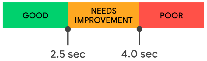
An LCP of 2.5 seconds or less is considered to be “good”. Above 2.5 seconds, the experience “needs improvement”, and above 4 seconds the experience is considered “poor”.
What does an LCP problem look like?
Here’s an example from a real-world ecommerce website:
In this example, the fashion icon Fendi‘s home page eventually loads, but I had to wait roughly 5s for the most important content to appear.
And while this is only one person’s experience, viewing real user statistics 1 made available by the Calibre Website Speed Leaderboard, I see mobile users waited an average of 8s and desktop users an average of 5s.
That’s an enormous amount of time for users to wait to see the products they want to buy!
Especially when keeping in mind that ideally that number is < 2.5s.
Seriously, pause right now, and count to 8-Mississippis…
This is the pain of a slow LCP.
Why does LCP matter?
When a customer clicks an advertisement, search result, or promotional link, the first few seconds of that visit are critically important.
Your marketing campaign worked, it has enticed the user, and the user has expressed interest!
Now the website needs to deliver on the promise that piqued their interest.
When the user has to wait, your campaign suffers!
A performance metric isn’t just an abstract number.
Again, it represents the user experience of a real-life shopper.
And improvements can really make a difference!
Nerdy Details
So, this page is actually a lot of things well:
- It has a
preloadlink for both the mobile and desktop image. - Both
preloadlinks have amediaattribute, which specifies which image should be preloaded, and which should not. - And both
preloadlinks have afetchpriority="high", requesting the browser increase the priority of these image fetches. - The
imgelement even hasloading="eager", requesting the browser fetch these images immediately.
But, unfortunately, it also does a few things that hurt performance:
- It uses the damned double-HTML pattern that I tend to moan and groan about.
- And that forces the download of both the mobile & desktop images.
- Both
imgelements have theloading="eager", and… - the desktop version appears first in the HTML, so…
- normally it would be requested first, but…
- thankfully, the
preloadlink has already requested the mobile version. - But “the wrong image” does still download, delaying the download of other assets after it.
- And by far the worst of all, after all that work to get the image to download as soon as technologically possible, the page delays the presentation of that image with some JS animation…
Based on the markup, it look like they use the Animate On Scroll Library (AOS), even though all of this could now be done with just CSS.
The real issues is that the browser must download, parse and execute the JS before any of this animation can begin, whereas a 100% CSS solution would just start animating once the initial page has rendered.
CLS: Is the page staying where the customer expects it to be?
Now imagine that the full page does load quickly, displaying your product information to the user promptly.
The customer sees the product, knows it is what they’re looking for, and prepares to hit the “Add to Cart” button.
Then something suddenly happens to the page and the “Add to Cart” button disappears from view.
The user is shocked and confused, wondering “What happened?”.
Maybe a promotional banner inserted into the page, maybe an image finished loading, maybe a font changed, or maybe any number of other possible things happened to the page.
The bottom line is: the user was ready to walk through the door, and the door disappeared.
Or perhaps worse, the customer wasn’t fast enough to pause their click, and now they are suddenly somewhere else.
In the first case, they have to re-orient themselves to find the button again.
In the latter case, they have to figure out how to get back to where they were.
In both cases, they are highly likely to just give up and move on to your competitor.
This is the type of experience CLS, or Cumulative Layout Shift, is designed to identify.
CLS measures unexpected movement of visible page content.
A low CLS means the page is more visually stable and predictable for the customer.
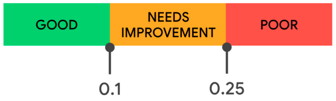
A CLS of 0.10 or less is considered to be “good”. Above 0.10, the experience “needs improvement”, and above 0.25 the experience is considered “poor”.
What does a CLS problem look like?
Here’s an example from a real-world ecommerce website:
In this example, the grocery icon Trader Joe’s Category page shows a “loading” message, then we see the page’s footer, then a block of text, then the footer again, then the block of text again, and finally the products appear.
All-in-all, I had to wait roughly 5s for the content to finally appear.
Worse, I had to sit through all of those page changes, wondering “What is happening?”, and whether the page would ever be ready.
And while this is only one person’s experience, viewing real user statistics 1 made available by the Calibre Website Speed Leaderboard, I see mobile users experienced an average of 1.60 and desktop users an average of 1.40.
Keeping in mind that ideally that number is < 0.10.
This is the pain of a high CLS.
Although the final page can look perfectly fine, the problem is what happens while the customer was getting there.
Why does CLS matter?
Unexpected movement can interrupt reading, cause customers to lose their place, or cause them to click the wrong link or button.
At the very least, it can cause confusion, irritation and make a user question the professionalism of a company and the reliability of a website.
For an ecommerce website, that can be a particularly painful part of the shopping journey.
But improvements can really help!
Nerdy Details
Nearly every time I see a super high CLS (or LCP), it is almost certainly a JS framework site. And this site is no different: it is React.
The other tell-tale sign is the paint/re-paint…
For a super sweet user experience, try viewing the page without JS; all you get is a text message stating:
You need to enable JavaScript to run this app.
(Do keep in mind this is a grocery store’s website.)
Ideally the page would arrive from the server with the full HTML content.
With this, the browser can render the page, download the images, etc., and the user can see, and interact with, the site.
Admittedly, it is really nice when the user can interact with filters and sorts and the existing page content just shuffles around, no request/response needed.
To achieve this, React could hydrate the existing content, without replacing it.
This way the user experiences a smooth page load and interaction.
INP: Does the website respond when the customer interacts with it?
Now imagine the page loads quickly and everything stays where it belongs.
The customer finds the product they want.
They click Add to Cart.
And nothing happens.
They wait.
Still nothing.
So they click again.
This time, the page finally responds.
This is the type of experience INP, or Interaction to Next Paint, helps measure.
INP looks at how quickly a page responds to user interactions throughout the visit. Those interactions can include clicks, taps, and other actions.
A low INP means the page quickly responds to the customer.
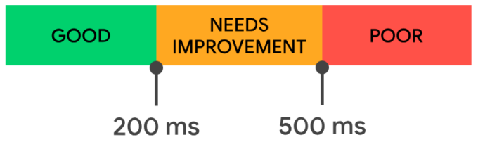
An INP of 200ms or less is considered to be “good”. Above 200ms, the experience “needs improvement”, and above 500ms the experience is considered “poor”.
What does an INP problem look like?
Here’s an example from a real-world ecommerce website:
In this example, the international clothing and homeware retailer Primark mobile navigation menu icon registers my initial click, but nothing happens.
That delay creates uncertainty.
Did the click work?
Should I click again?
Is the site broken?
As an impatient user, I do click again.
And shortly after that second click, the menu finally opens.
More than 6s after my initial click.
And while this is only one person’s experience, viewing real user statistics 1 made available by the Calibre Website Speed Leaderboard, I see mobile users waited an average of 562ms and desktop users an average of 194ms.
Keeping in mind that ideally that number is < 200ms.
This is the pain of a high INP.
My example might seem a little contrived, as I was clicking the menu immediately upon page load, but that is a realistic situation: if a user knows what they want, they do not wait for your page to completely load.
In such a case, the customer has interacted with the page.
But the website doesn’t provide immediate visual feedback.
Why does INP matter?
Responsiveness is especially important for interactive ecommerce experiences.
Menus, filters, search, product options, “Add to Cart” buttons, checkout controls, and other interactions all depend on the website responding when the customer does something.
A page doesn’t necessarily have to complete every operation instantly.
But it should provide feedback quickly enough that the customer knows their interaction was received.
Improvements can make a real difference!
Nerdy Details
You might note that in my example I tried interacting as soon as I could after the page’s initial paint.
This was intentional, to demonstrate the pain of the modern user’s experience.
In this case, the page’s JS was likely still busy downloading, and certainly still busy processing, so my menu click had to get in line and wait for the single-thread to free up enough to handle my click request.
Whether realistic or not, users expect near-instant reactions to their interactions.
The functionality doesn’t need to complete near-instantly, but there must be some form of reaction.
There are a lot of methods developers can use to reduce INP, including writing smaller functions, providing breaks between function calls, replacing traditional JS functionality with new native HTML+CSS options, etc.
It is our job to deliver what provides the best user experience.
Find Your Biggest Web Performance Opportunities
Core Web Vitals can tell you whether customers are experiencing a performance problem.
The next step is understanding which problems are worth your attention.
My Web Performance Assessment combines real-user performance data, Core Web Vitals, and targeted investigation to identify the performance issues that may be creating the most meaningful friction in your customer journeys.
Rather than treating every performance problem equally, I prioritize opportunities based on their potential business impact, so your team can focus its time and performance budget where it matters most.
Know where to invest your performance budget before you spend it.
Learn more about Web Performance & Optimization →
What’s next?
Now that we know why web performance is important, what performance issues look like, and how the three Core Web Vitals can help us track user experience issues, the next article will look into performance monitoring, so we can to see what our customers are actually experiencing.
Specifically, Real-User Monitoring (RUM) can track real user metrics over time and alert your team when performance begins to deteriorate.
Instead of discovering a problem months later, you can start investigating while it is happening!
Additionally, we’ll take a look at Synthetic Monitoring (aka Lab Monitoring), which let’s us examine our sites before they go live, so we can catch performance issues before they affect real users!
And during the holiday shopping season, that difference can make all the difference.